മലയാളത്തിന്റെ
ഡിജിറ്റൽ സൗന്ദര്യം
സന്തോഷ് തോട്ടിങ്ങൽ
മലയാളത്തിന്റെ
ഡിജിറ്റൽ സൗന്ദര്യം
സന്തോഷ് തോട്ടിങ്ങൽ
1. കഥ ഇതുവരെ
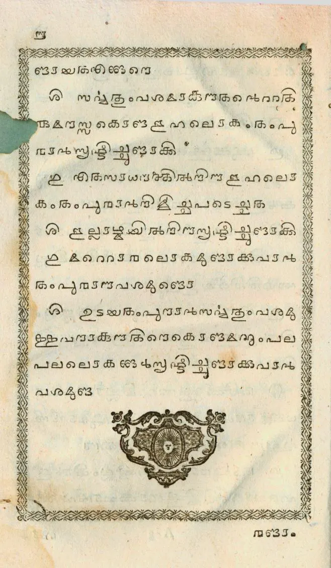
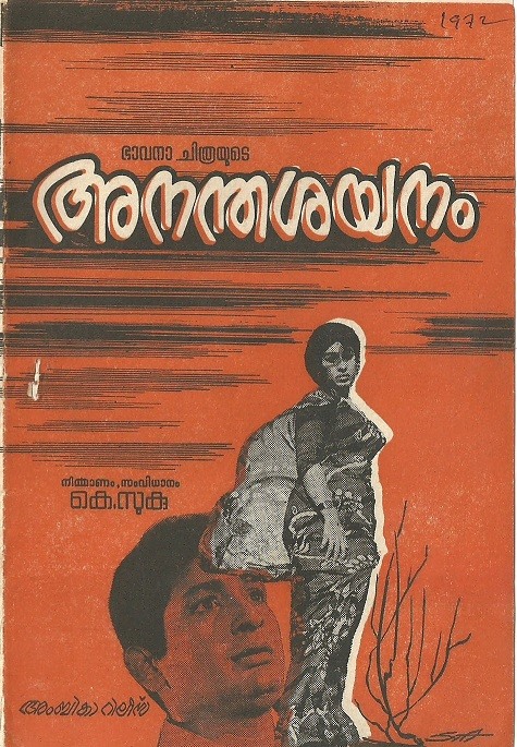
സംക്ഷേപവേദാർത്ഥം, 1772 - മലയാളത്തിൽ അച്ചടിക്കപ്പെട്ട ആദ്യപുസ്തകം
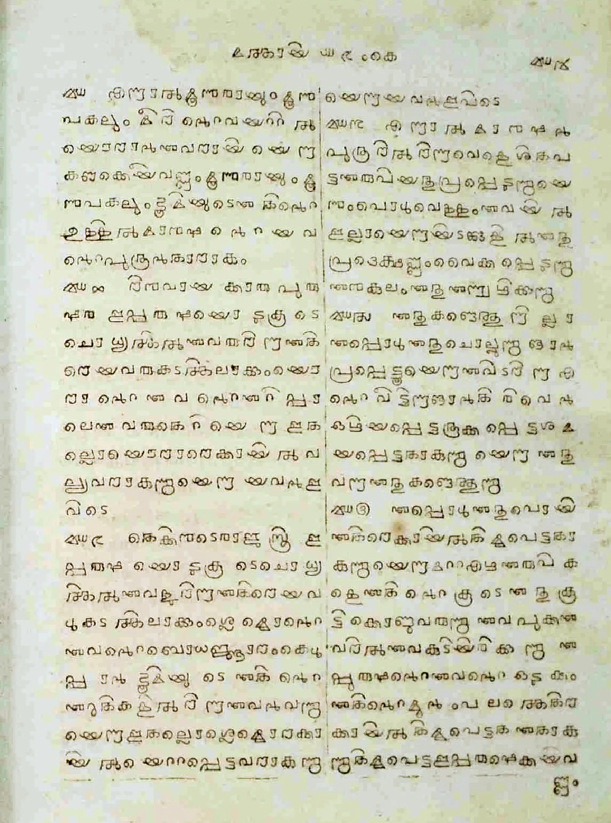
റമ്പാൻ ബൈബിൾ, 1811, ഇന്ത്യയിൽ നിന്ന് മലയാളത്തിൽ അച്ചടിക്കപ്പെട്ട ആദ്യപുസ്തകം

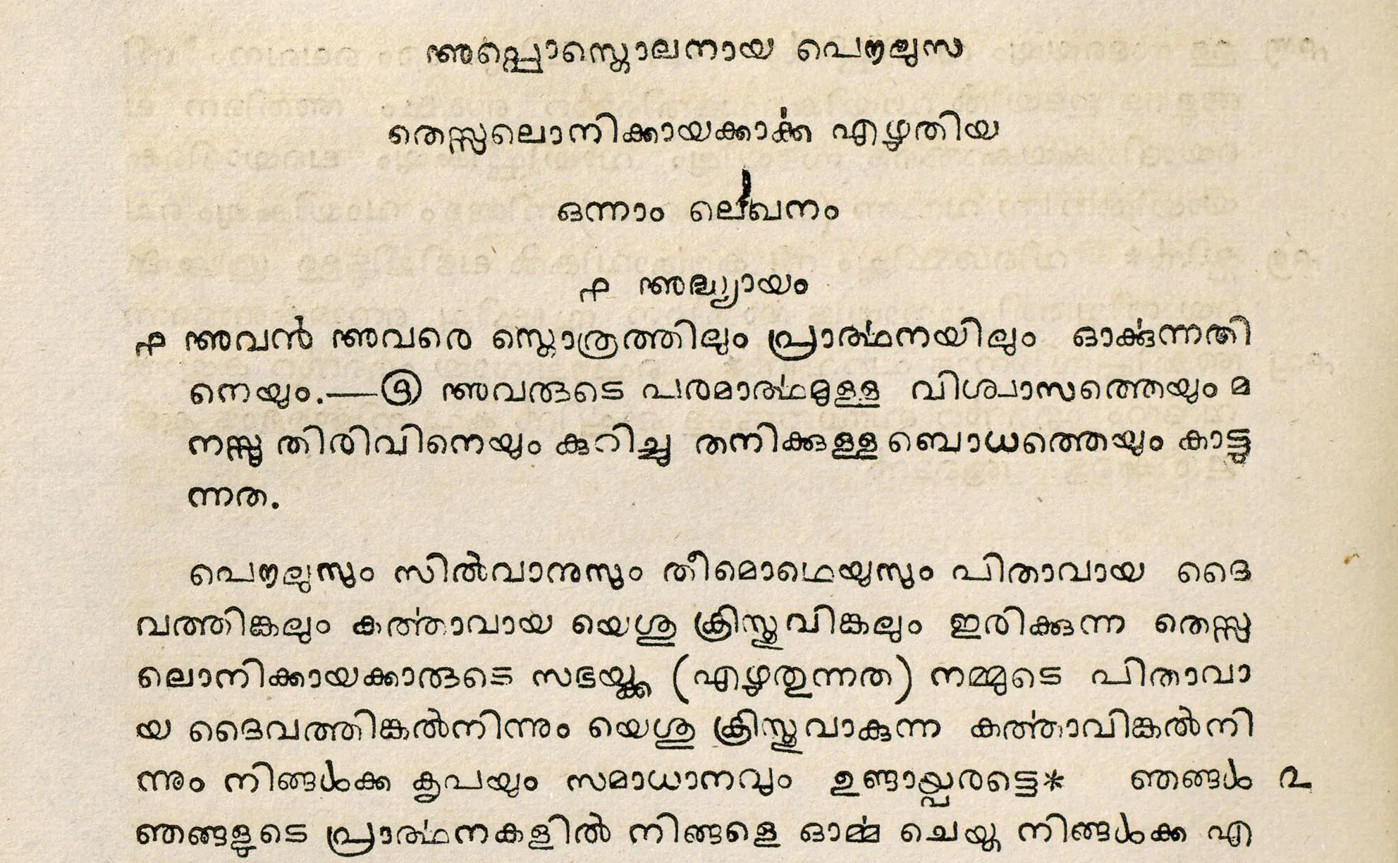
പുതിയനിയമം, 1829, ബെയിലിയുടെ മലയാളം ഫോണ്ടിൽ.
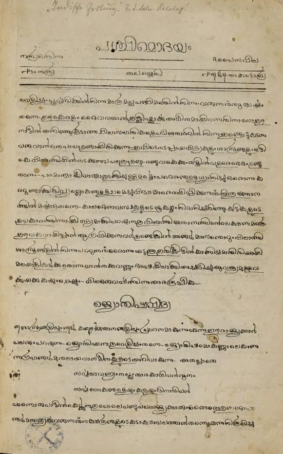
പശ്ചിമോദയം, ഓക്ടോബർ 1848. തലശ്ശേരിയിൽ ലിത്തോഗ്രാഫ് ചെയ്തത്. (ഗുണ്ടർട്ട് പോർട്ടൽ, ടുബിംഗൻ യൂണിവേഴ്സിറ്റി)
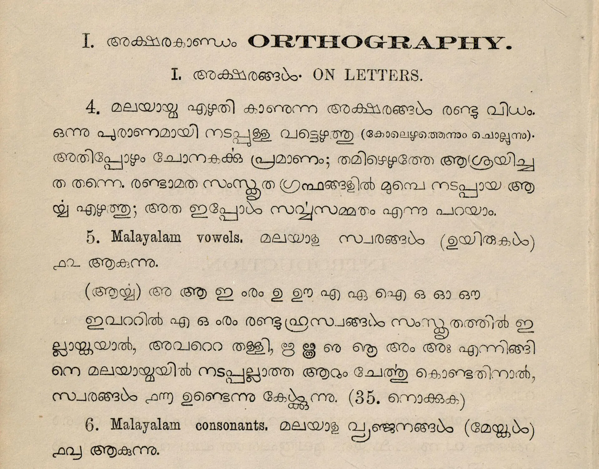
മലയാളഭാഷാവ്യാകരണം,ഗുണ്ടർട്ട്, 1868. ബേസൽ മിഷൻ മംഗലാപുരം
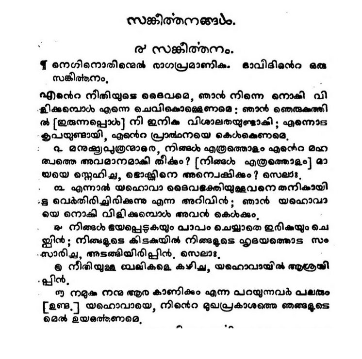
1839 - സങ്കീർത്തനങ്ങൾ
1845 - പഴഞ്ചൊൽമാല, ഗുണ്ടർട്ട്
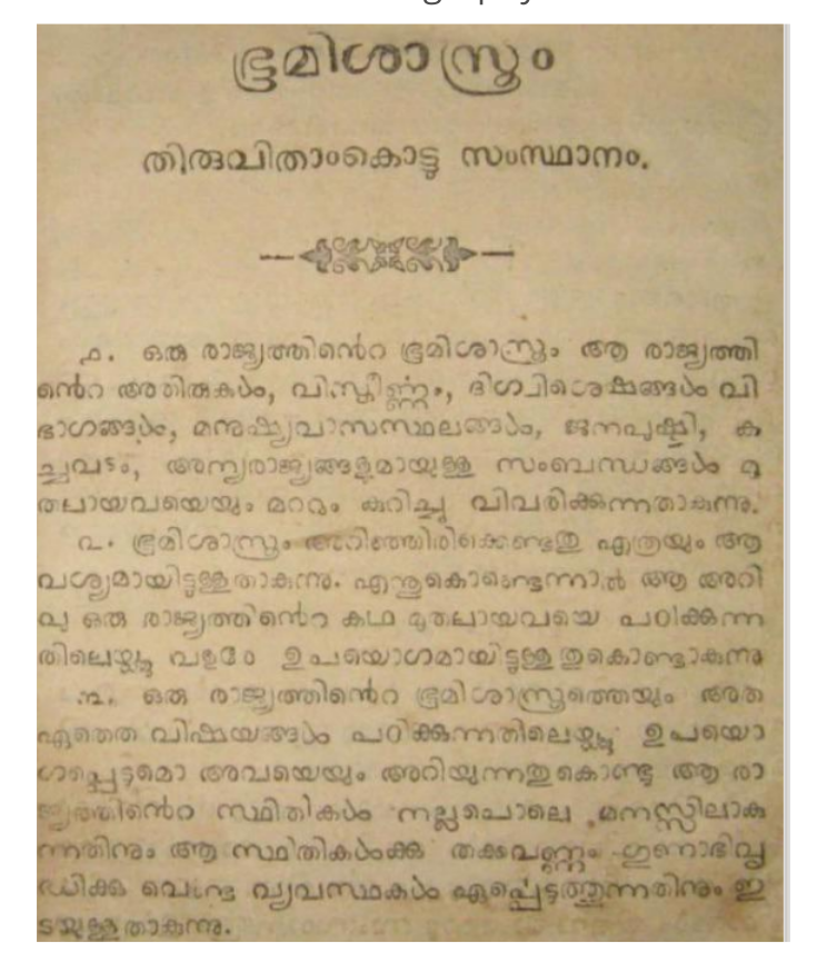
1878 - ഭൂമിശാസ്ത്രം പാഠപുസ്തകം
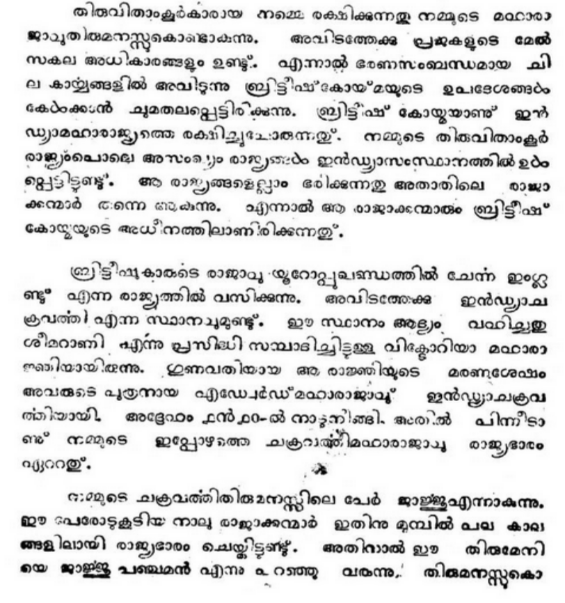
1916 - നമ്മുടെ ചക്രവർത്തി
1930 - ശബ്ദതാരാവലി
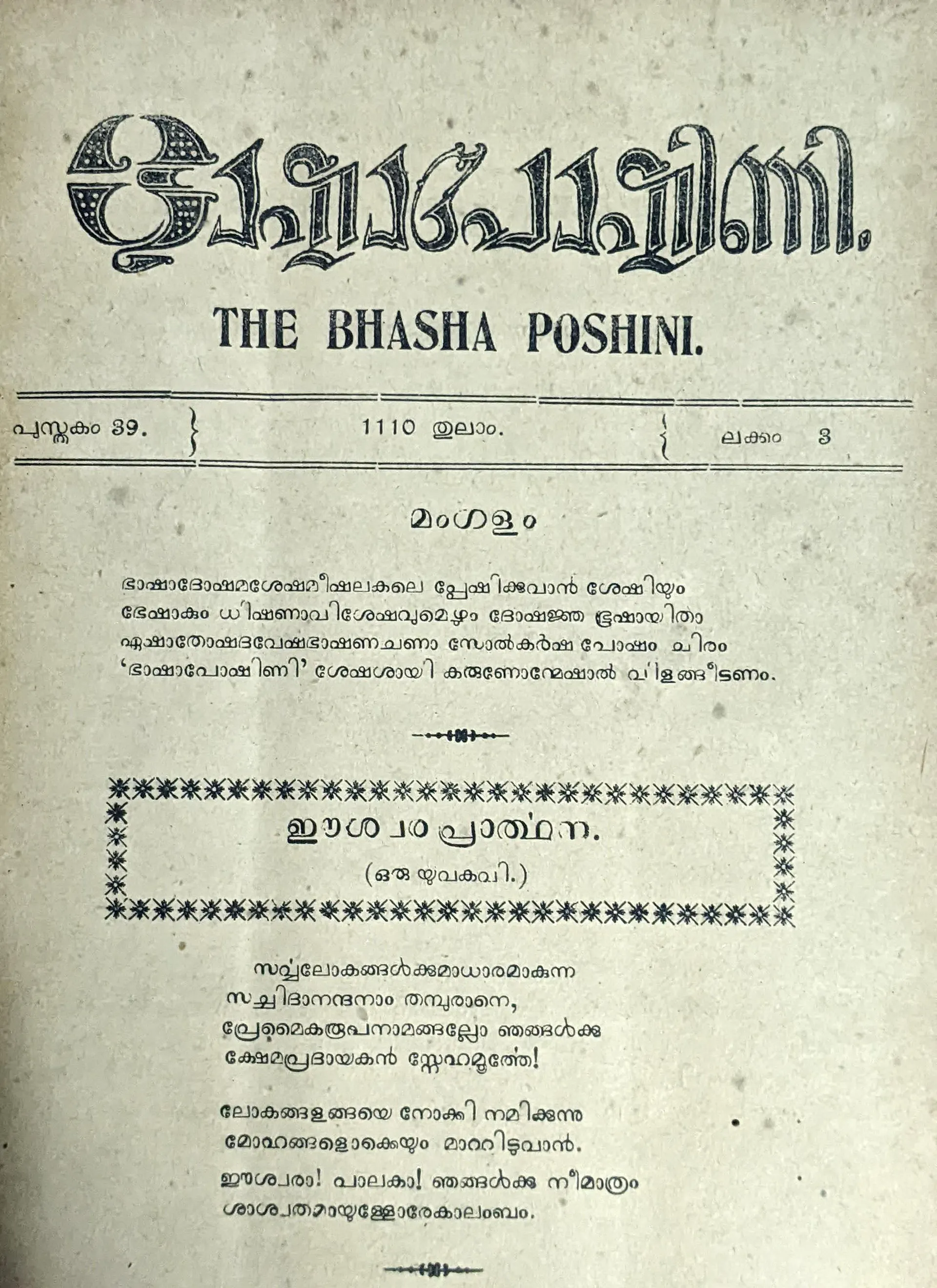
1930 - ഭാഷാപോഷിണി
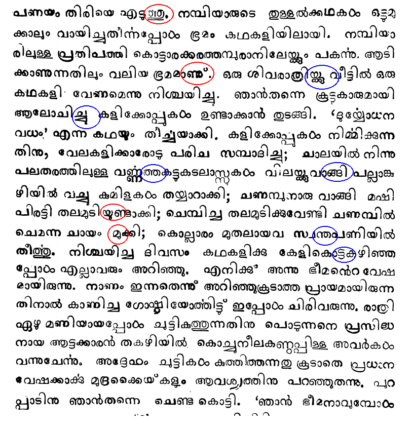
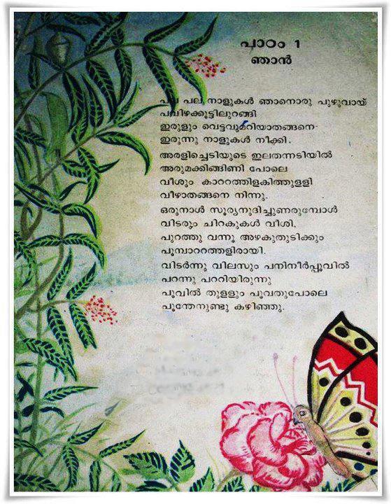
1960 - പാഠപുസ്തകം
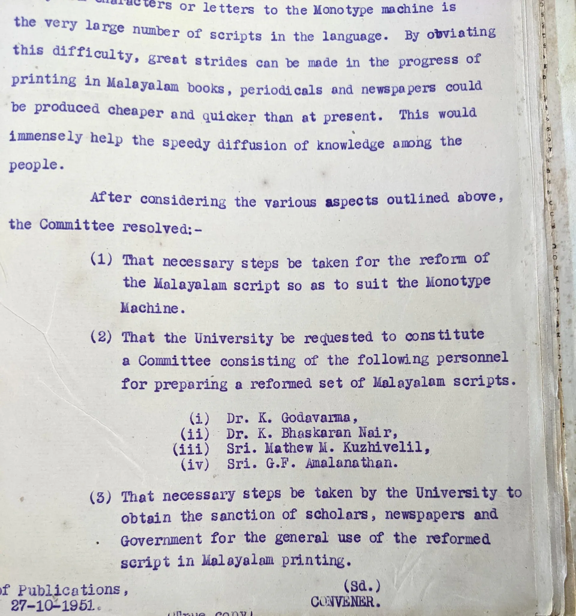
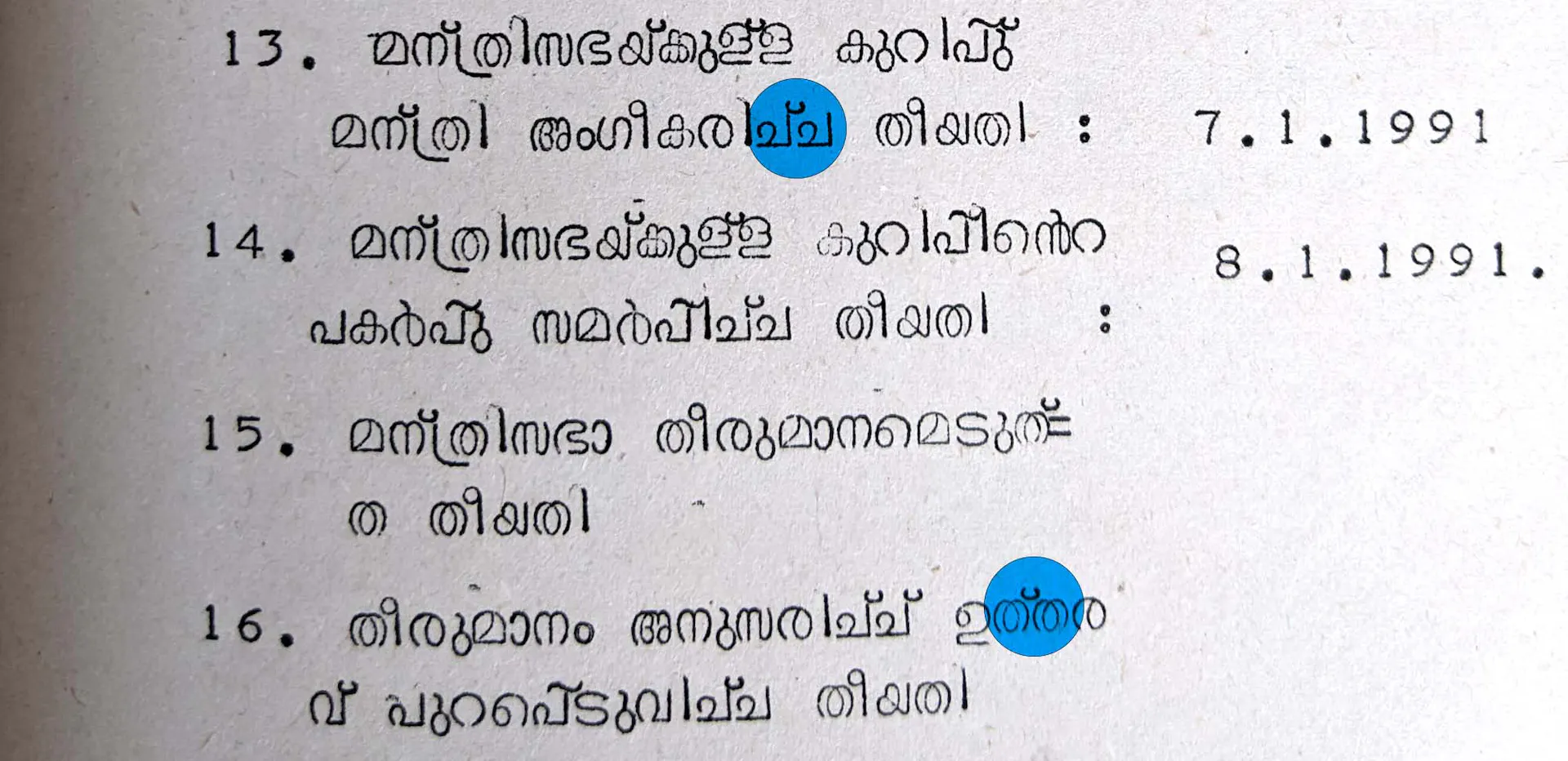
Resolutions of the Script Abbreviation Committee at a 1951 meeting, outlining their objectives.
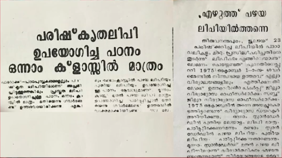
Newspaper article from 1953, typeset using the abbreviated script.
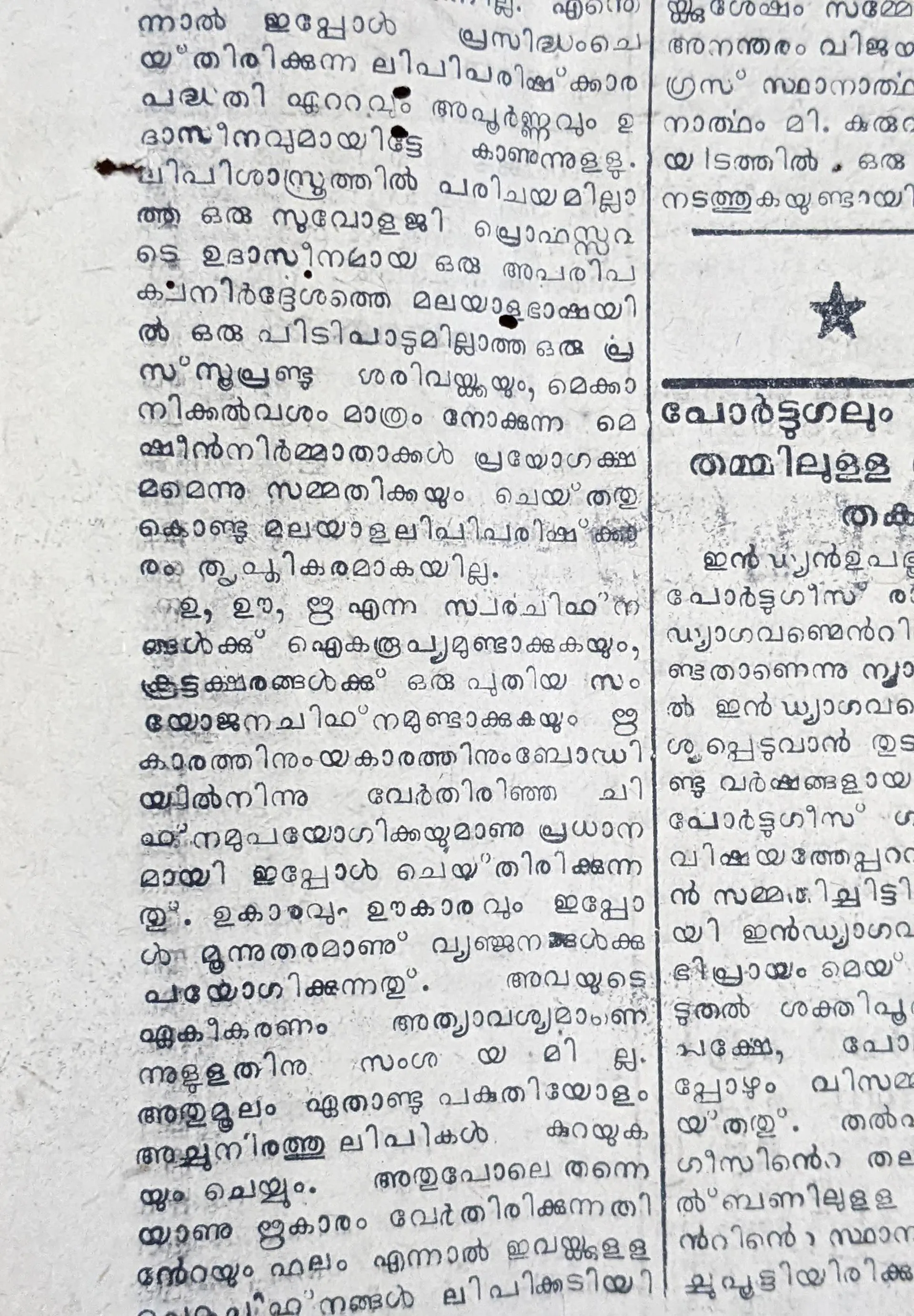
Newspaper article in Malayala Manorama on the University of Travancore’s script abbreviation initiative, dated June 16 1953.
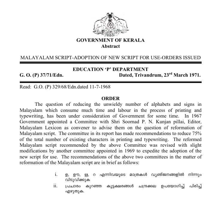
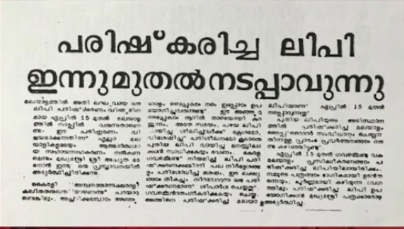
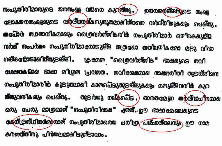
1971 Government of Kerala order announcing the introduction of the reformed Malayalam script.
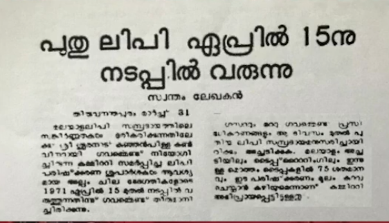
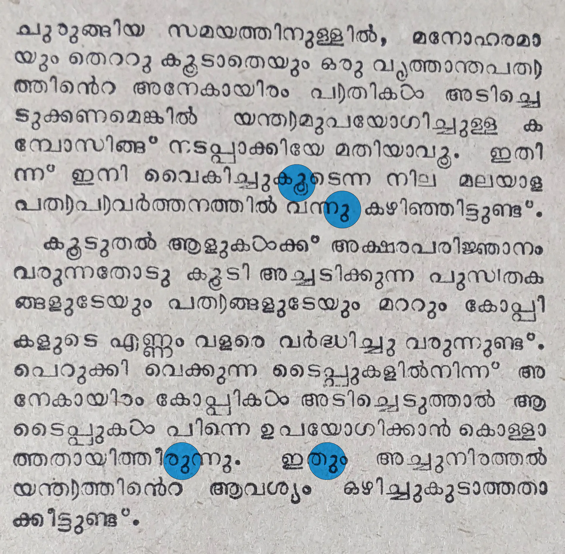
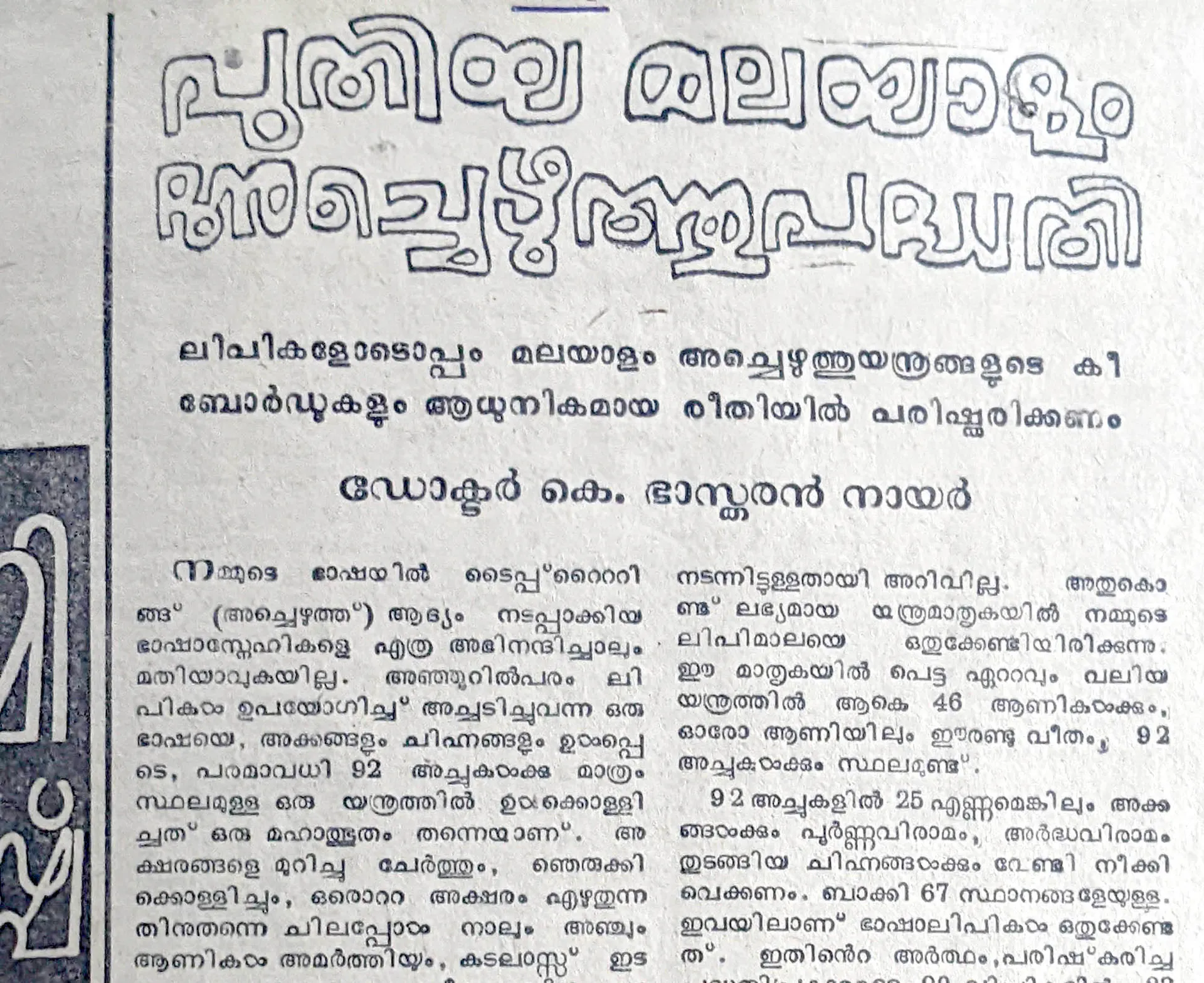
1971 newspaper article in Mathrubhumi by K Bhaskaran Nair introducing Reformed Malayalam: its features and development.
1980
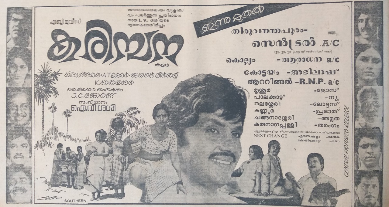
1983
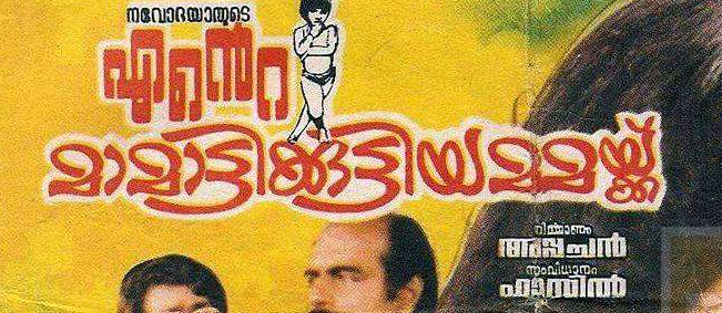
1986
1988
1997
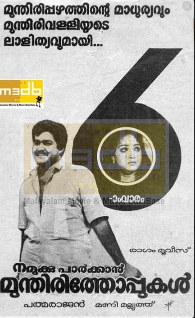
2017

2017
2017
2017
2017
2022
2022
2022


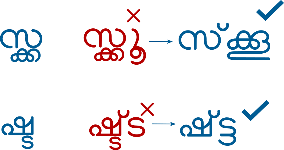
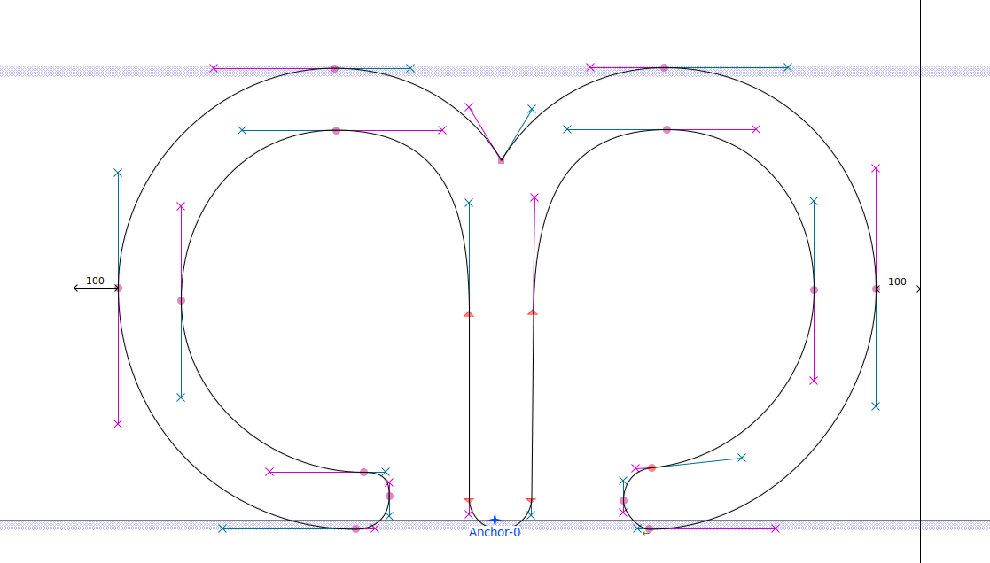
2. വടിവൊത്ത അക്ഷരങ്ങൾ
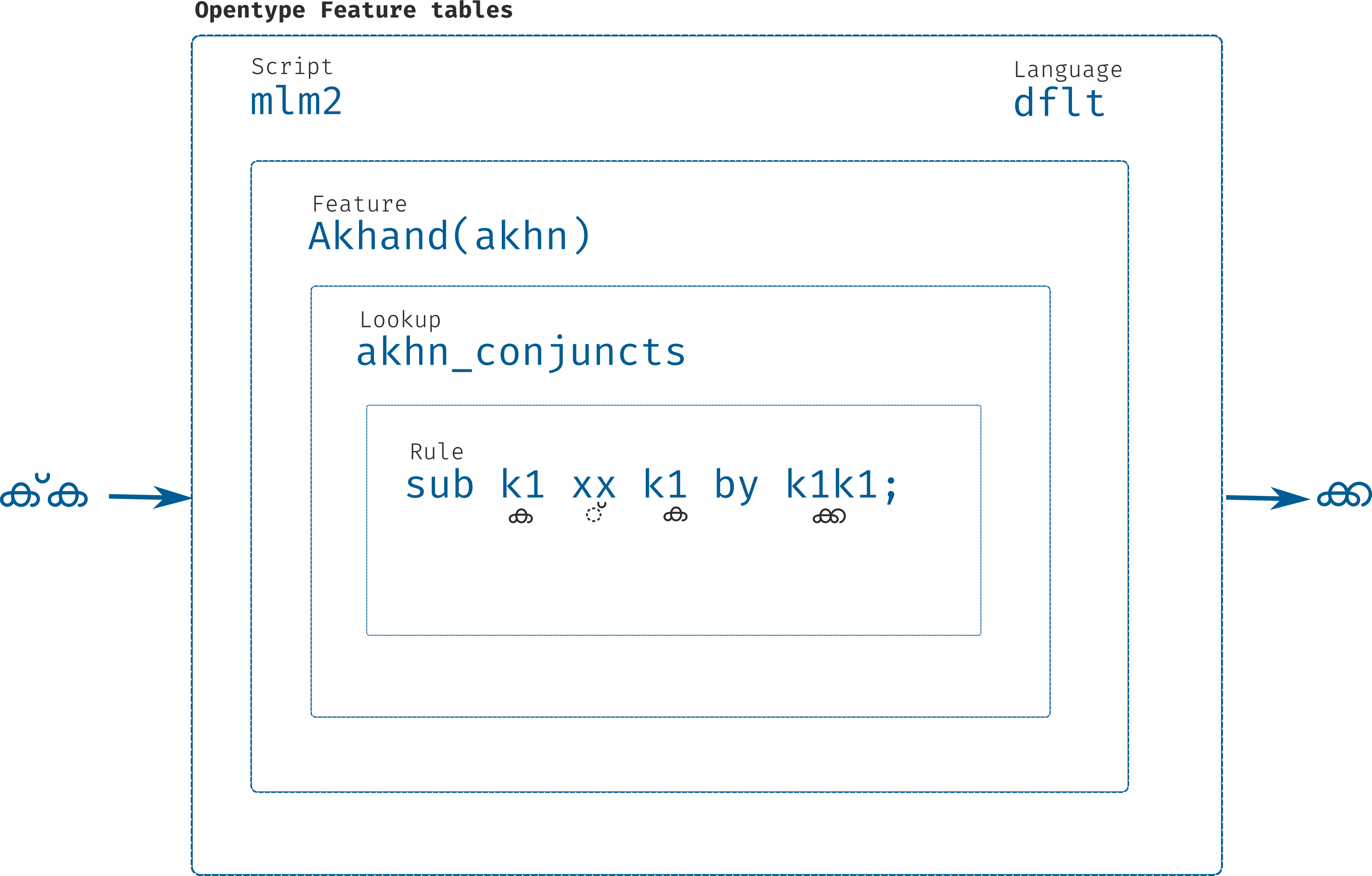
3. ഫോണ്ടുകൾ
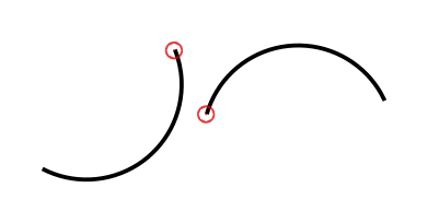
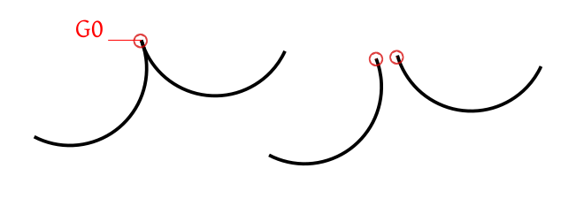
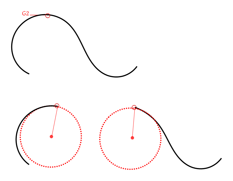
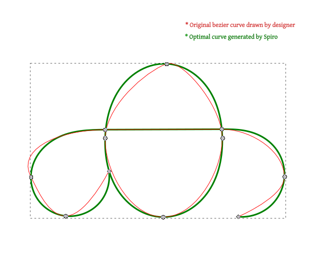
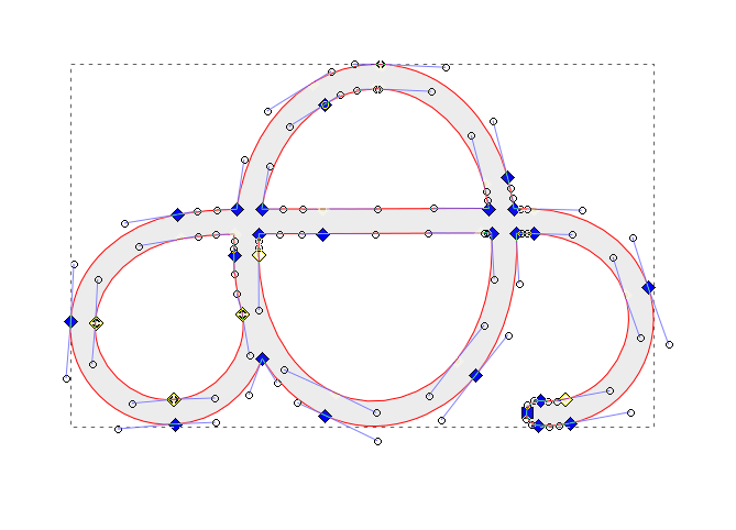
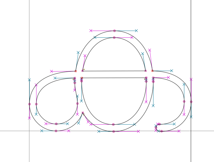
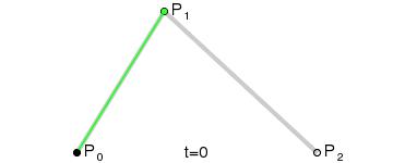
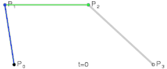
Quadratic Bezier curves
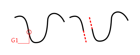
Cubic Bezier curves


The fixed restrictions of the UI metrics was the primary, non-negotiable term in the Nirmala UI design brief: whatever we did had to fit within the vertical metrics of the Segoe UI and other UI fonts. The core target size for UI use, despite the increase in screen resolutions on many Win8 devices, is still 9pt at 96ppi, i.e. 12 ppem, with some Office UI items displaying at 8pt (with further restrictions on ppi height through VDMX adjustments at some sizes). At 12 ppem, we have exactly 3 pixels below the baseline before we hit the OS/2 WinDescent limit, beyond which glyphs will be clipped. Many of the Indian writing systems make significant use of the space below the baseline, so we had to employ a number of strategies to squeeze subjoined letters and other descending shapes into the UI metrics. The results are not all pleasant, and some contravene the norms of these writing systems, achieving only a legible decipherability, rather than true readability.
John Hudson, Designer of Nirmala
ഇവിടെയുണ്ടു ഞാന് എന്നറിയിക്കുവാന്
മധുരമാമൊരു കൂവല് മാത്രം മതി
ഇവിടെയുണ്ടായിരുന്നു ഞാനെന്നതി-
ന്നൊരു വെറും തൂവല് താഴെയിട്ടാൽ മതി
ഇനിയുമുണ്ടാകുമെന്നതിന് സാക്ഷ്യമായ്
അടയിരുന്നതിന് ചൂടുമാത്രം മതി
ഇതിലുമേറെ ലളിതമായ് എങ്ങനെ
കിളികളാവിഷ്ക്കരിക്കുന്നു ജീവനെ!
ഇവിടെയുണ്ടു ഞാന് എന്നറിയിക്കുവാന്
മധുരമാമൊരു കൂവല് മാത്രം മതി
ഇവിടെയുണ്ടായിരുന്നു ഞാനെന്നതി-
ന്നൊരു വെറും തൂവല് താഴെയിട്ടാൽ മതി
ഇനിയുമുണ്ടാകുമെന്നതിന് സാക്ഷ്യമായ്
അടയിരുന്നതിന് ചൂടുമാത്രം മതി
ഇതിലുമേറെ ലളിതമായ് എങ്ങനെ
കിളികളാവിഷ്ക്കരിക്കുന്നു ജീവനെ!
ഇവിടെയുണ്ടു ഞാന് എന്നറിയിക്കുവാന്
മധുരമാമൊരു കൂവല് മാത്രം മതി
ഇവിടെയുണ്ടായിരുന്നു ഞാനെന്നതി-
ന്നൊരു വെറും തൂവല് താഴെയിട്ടാൽ മതി
ഇനിയുമുണ്ടാകുമെന്നതിന് സാക്ഷ്യമായ്
അടയിരുന്നതിന് ചൂടുമാത്രം മതി
ഇതിലുമേറെ ലളിതമായ് എങ്ങനെ
കിളികളാവിഷ്ക്കരിക്കുന്നു ജീവനെ!
ഇവിടെയുണ്ടു ഞാന് എന്നറിയിക്കുവാന്
മധുരമാമൊരു കൂവല് മാത്രം മതി
ഇവിടെയുണ്ടായിരുന്നു ഞാനെന്നതി-
ന്നൊരു വെറും തൂവല് താഴെയിട്ടാൽ മതി
ഇനിയുമുണ്ടാകുമെന്നതിന് സാക്ഷ്യമായ്
അടയിരുന്നതിന് ചൂടുമാത്രം മതി
ഇതിലുമേറെ ലളിതമായ് എങ്ങനെ
കിളികളാവിഷ്ക്കരിക്കുന്നു ജീവനെ!
ഇവിടെയുണ്ടു ഞാന് എന്നറിയിക്കുവാന്
മധുരമാമൊരു കൂവല് മാത്രം മതി
ഇവിടെയുണ്ടായിരുന്നു ഞാനെന്നതി-
ന്നൊരു വെറും തൂവല് താഴെയിട്ടാൽ മതി
ഇനിയുമുണ്ടാകുമെന്നതിന് സാക്ഷ്യമായ്
അടയിരുന്നതിന് ചൂടുമാത്രം മതി
ഇതിലുമേറെ ലളിതമായ് എങ്ങനെ
കിളികളാവിഷ്ക്കരിക്കുന്നു ജീവനെ!
പച്ചക്കള്ളം വെള്ളം
കാച്ചാണി വെള്ളയമ്പലം
പച്ചക്കള്ളം വെള്ളം
കാച്ചാണി വെള്ളയമ്പലം
പ്രകാശം പുത്രൻ
കൂലി കുസുമം
പ്രകാശം പുത്രൻ
കൂലി കുസുമം
🥥തേങ്ങ
🥥തേങ്ങ